Friday 18 December 2009

Technolgy Evaluation

What have you learned about technologies from the process of constructing this product?


The knowledge I have gained from using Adobe Photshop, Fireworks, and Paint.Net have increased radically since starting my preliminary. I am now able to construct a magazine front cover, double page spread and contents page using all three programmes. For my preliminary I was only able to construct my front cover using Microsoft Publisher, which is in adequate in relation to the other software's. By using the layer tool on Photoshop this allows me to position and apply different images and text in a neat and orderly fashion - which in all looks professional. I can now easily adjust the different contrast levels following my own house style, apply shadows, bevel text boxes, adjust fonts by making them bolder, put a shadow around them and basically construct the whole front cover. I have also learned that lighting is the key to taking a good photograph, applying the rule of thirds and depth of field in order to obtain a professional looking image. Also Photoshop allowed me to make the image look sharper, cutting the main image out with the lasso tool, using the magic wand to erase the background, applying different levels of contrast to the image; making it look more professional as though it had been created in a studio. In all I have learned all the basics from creating my preliminary on Publisher, to advancing my skills onto different software's such as Photoshop and Fireworks, and maintaining a professional house style throughout, with the help from my many magazine analysis', my own imagination, and finally working independently and consistently.


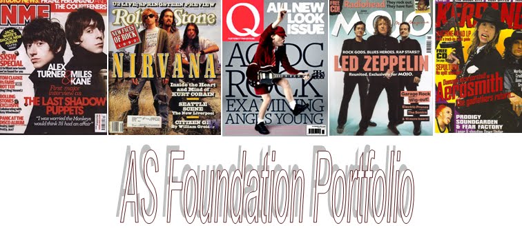
I used  my original image to help me produce a highly stylised front cover.

Attracting An Audience Evaluation

How did you attract your audience?

In order to attract my target audience I researched NME magazine - the Morrissey edition. 'Bigmouth strikes again' is one of his song titles, which immediately grabs the target audience's attention. I followed the similar conventions of this magazine front cover, including the aging image of 'Towler Flannagan', which immediately portrays an old rock star, who is coming back on the scene. The stern look, when Morrissey poses, I applied this technique; which enabled me to show the age of the subject. The receding hair and grey hairline, also shows age. As I mainly wanted to portray the main subject as an aging rock star, there was no need for excessive editing. I made the main focus the guitar, which shows what he was most famous for - and not being a sexual icon like many talented musicians today. I applied a serif black, red and white font throughout my magazine to create cohesion and to allow it to look professional and mature. I stayed away from bright colours as I believe this attracts a younger audience, due to my target audience being mainly of the age of 18-50 years this would seem unprofessional. The images and text used allowed me to show a different subject who was once known for his crazy antics, to now being a much more laid back country-rock singer. I opted for a house themed photograph, with logs for the fire, a Fender guitar in hand and a family couch to imply a country like feel.


NME magazine highly influenced my product, especially this particular front cover.

Audience Evaluation

Who would be the audience for your media product?


I believe men between the ages of 18-50 would benefit from 'ZEE' magazine most. Due to them living through the era of the start of alternative rock in the early 1980's, and the fact that they experienced and appreciated the different style of music. As men are mostly associated with the genre of rock more so than woman, I do not believe there would be such a high demand of alternative rock followers of which are women. I think also it is not necessarily a case of living through the era of the start of alternative rock, but more so the appreciation of the unique style. Therefore any rabid music followers may be interested in my media product.


David Bowie was an 80's icon.

Media Institution Evalutaion

What kind of media institution might distribute your media product?

I believe the most beneficial media group to distribute my magazine would be IPC as I have already stated earlier in my research. IPC media is a leading consumer magazine publisher. Over 26 million UK adults read an IPC magazine of some sort. As there is a gap in the market for alternative rock music magazines today, I believe 'ZEE' magazine would benefit from such a well - known, knowledgeable company like IPC. As the UK has the highest demand for alternative rock, IPC would benefit from 'ZEE' magazine also, because it is unlike any of the other 80 magazines IPC have published. NME; I have noticed, involve a wide variety of different genres, due to 'ZEE' only being based around the one genre of music it will be of help to the company. I believe 'ZEE' magazine has something special to offer its audience, like its states on the by line - 'The UK's only alternative rock magazine'.


NME magazine is published by IPC. I took inspiration from this magazine for my product.

Social Group Evaluation.

How does your media product represent particular social groups?

I based my magazine around alternative rock followers, around the era of the 1980's following bands such as The Smith's and The Cure. But adding a more modern day style allowed me to attract a younger audience who are also interested in older music. By photographing a middle aged man for my front cover, and naming bands from different era's this allows for a wider target audience, as there is something for everyone. Not everyone may like the lead subject, but due to the different bands and solo artists listed I'm sure there is something for everyone. Inside, on the contents page, I photographed a younger female around the age of 18. This automatically widens my target audience, as she is seen more as a sex symbol (with red lips, pale skin and dark hair) more so than a talented musician like (Towler Flannagan) my main subject. Laura Mulvey's male gaze applies to my media product, there is both a patriarchal view on Flannagan; who is seen as a lead man and a more voyeuristic view on Lila who is seen as somewhat of a fetishistic. Due to my main subject now singing country music, I aimed to dress him as a country singer in more laid back attire rather than hard core rock and role clothing.


The Smiths are a successful band from the 80's. They are a stereotype of the music that I am trying to portray throughout my magazine.

Tuesday 15 December 2009

Forms and Conventions Evaluation

In what ways does your media product use, develop or challenge forms and conventions of real media products?

Throughout my magazine I followed the forms and conventions of the magazines I had analysed including Q and NME. I found that the following magazines involved conventions of bar codes - which I created myself using Paint.Net, the date and magazine issue which are regularly printed on most magazine front covers, the colours used; I aimed to follow the same colour scheme of black, white and red in order to create cohesion and a tidy layout. The colour red is known to stimulate brain activity and catch the readers attention more so than other colours. Therefore i used this colour when necessary. Another form of convention which I followed are the puffs around the main image, I decided on a simplistic graphology as in Q magazine, which relies on one main image and a small number of puffs surrounding the image, as I believe this is a more professional approach rather than cluttering the magazine with unnecessary text and images. Whilst the contents page consists of puffs, images which are relevant to the front cover, usually dates and issue numbers, a magazine website and features within the magazine. I developed all of these conventions within my own house style to appeal to a specific target audience of alternative rock followers. For my double page spread I challenged the conventions of most magazine double page spread layouts which use a block text box and backdrops; and interpreted my own house style issuing a translucent text box, allowing my readers to see the image underneath. I believe this shows my own personal house style and makes my magazine seem more unique. I followed the normal conventions of most music magazines, including a heading, a lead, sometimes a drop capital to start the article off, a main image. I aimed to vary these conventions by changing the image to A3 size, this allowed me to use the layer tool on Photoshop to bring the text to the front. Not many magazines use only one main image, therefore I used this to my advantage to make my magazine seem more distinctive. But I followed the regular conventions, by applying page numbers along the bottom and following all the normal magazine conventions just inserting my own personal style.


I followed Q Magazine's simplistic graphology and applied it to my own product, as I believe this approach looks extremely professional.

Double Page Spread

This is the final design for my double page spread. I chose a style which followed a similar design as my front cover and contents page, using the same colour scheme of white, red and black also using the same serif font 'century schoolbook' - in-keeping with the rest of my magazine. As well as the language I used in the article, which fitted with the chosen subject's image, I opted for a more laid back approach with regards to my double page spread image. The fact I chose to place the subject sitting on a blue couch strumming to an old guitar, reflecting the rocker's personality. Another point I was trying to make was that he had been out of the public eye for many years now, and is therefore trying to regain his popularity and place himself back in the public eye. I fitted it across two A4 size sheets (A3), then applied a translucent text box over the top in which to place my article. Instead of just centering my main image I wanted to fit my text around it, therefore I applied the rule of thirds, by splitting the image into nine equal parts by three equally-spaced horizontal lines. Having already chose the translucent text box, the remainder of the image was not as important as the subject, yet I wanted this to be seen to give the picture more depth. I chose the black font and red lead, as I felt this is associated more with a masculine themed backdrop. The red is bright and vibrant, yet does not take the emphasis away from the subject - as he takes up 2 thirds of the A3 page. I used a drop capital 'I' at the beginning of the text, following the conventions of many music based magazines, this also gives the magazine a more professional feel.
I believe that the image I used can identify with any middle aged British man, as a portrayal of a working man, wearing plain clothes and not overly-edited so as to clearly show the reader that he is an 'average' person. Today in many music based magazines men are not seen as objects like woman, who rely mainly on their appearance, but rely mainly on their talents or personalities. This was the point I was trying to prove throughout my magazine, which enabled me to use what I had and to not change my main image to make it into something unrealistic and unbelievable. Therefore in creating this image I believe I will attract my target audience of alternative rock listeners, as they are more interested in the music more so than appearance. The target audience of my magazine can fall between any generation, as I believe anyone of any age can share an interest in the same genre of music, regardless of the era is was brought out. The image is representative of the text, in that it states he isn't just a has been, but that he is an average man who enjoys his music, and wants to be heard. The image links to the front cover, as the subject is not posing, but simply showing his appreciation of music.
I included a lead paragraph in a narrative style in order to create a setting for my article and establish some of the history behind my artist. There are some requirements of prior knowledge in that I have mentioned band members names and songs such as, "Towler Flannagan's acclaimed piece, 'Seven Degree Burn,'" and, "The Cure and The Smiths." I also, however, set the beginning paragraph in a narrative style so that the audience, if they perhaps had not previously heard of the artist, could understand some of his past exploits, creating a sense of intrigue. The next part of my article was an interview, in which I chose to use direct quotations from the artist. I had found from my previous research that when music magazines use this form of interview it created a more personal and intimate feeling, giving the reader a stronger affinity with the artist. I also contrasted my more formal style of writing in the first section of narrative, with a colloquial and friendly tone in the interview, such as, "I bet. So where are you touring?", and, "So you have a baby now?" At the end of my article I placed contact information in regards to the artist's tour dates, which followed the conventions displayed in the double page spread features I had analysed, along with page numbers at the bottom of the page.

Monday 14 December 2009

Contents Page


My final design for my contents page follows the same colour scheme of red, white and black like my front cover. These are an extremely popular choice of colour for music magazines, both Q and NME regularly follow the same colour scheme. I applied these colours in order to create the same professional appearance.
I placed the masthead from my front cover on the heading of the contents page following the conventions from magazines such as Q, Mojo and NME. This establishes my magazines house style, and will distinguish 'Zee' magazine from its competitors. I used layers to my advantage, placing the different elements in a well-constructed layout for my header, contents list and images.
I opted for the same serif font throughout my project to create a sense of cohesion and uniformity, applying a bold font for the cross heads. The banners also follow the same font style.
The images display distinctly different representations of the sexes; the first being of a young female, which I edited to accentuate her pale skin and pink lips, which is associated with the vigour of youth. The male image, however, is only minimally edited with the focus being on mainly his rugged manliness, rather than his attractiveness. This also shows his talent on the guitar, whereas the female is merely seen posing.
I organised my contents page under a cross heading titled 'features.' This created better continuance through the piece, meaning it was well ordered.
I also chose to place a banner text within a circle to attract the reader's attention and help create a fuller layout, with less white space.
Following the conventions of a typical music magazine's contents page I applied contents numbers under each image, for the purpose of letting the reader know which page the chosen article comes under with ease.
I added a banner at the bottom of my contents page to allow my magazine to have its own house style - applying the 'Zee' within 'Magazeene' and the type of genre 'Zee' magazine is influenced by; rock and indie.
I have listed a a numerous amount of different features to attract an audience who aren't only interested in the main article, this allows for a wider target audience.
Initially I was going to use the image to my left, i edited the colour of the couch using Photoshop - the magic wand tool as I believed this looked more like a studio couch more so than the blue one. But as the setting was supposed to be laid back, I believed the colour black to be a more intimidating colour, blue is much more country. I also edited the colour of the subject's T-shirt, from grey to green allowing a more professional approach to the 'photo shoot' - a change of clothes.

Magazine front cover

I decided on an alternative rock theme, based on indie rock music which was extremely popular in the late 1980's early 1990's, and is now regaining popularity. Using Adobe Photoshop elements aided me in being more creative with my design.

The masthead 'Zee' is a pun on the letter Z, using it's phonetic spelling, along with the 'zine' sound in magazine; which I think gives the magazine a playful, quirky tone from the offset. By using a serif bold font in block capitals this gave the magazine a more striking focal point, along with the white font on the red backdrop. I chose a red, white and black colour scheme throughout my magazine in order to link all of the pieces. These colours are common within the field of music magazines, as they are bold, eye-catching and give a professional appearance to the design.
The main image itself represents an aging rock star, upon his comeback to the music industry. I chose not to edit the image excessively to make the subject appear more attractive, as the haggard and rugged appearance is more associated within this particular strand of the rock genre. I have included the original image (right) in order to show the comparisons between the two. I used the magic wand tool to remove the background of the image for the purpose of formulating my own contrasting background. I used the red-eye removal tool - to remove any traces of red-eye caused by the camera flash, which had made my image seem unprofessional. I made the image seem brighter by adjusting the contrast, and by altering the colour range in order to give it the look of a real photo shoot. The central focus of the image is the guitar itself, the contrast tool worked well in relation with the wood, making it bright in comparison to the grey background. The purpose of the unsmiling expression was to represent the rock star's personality and the way that he was portrayed by the media. I have learned from analysing many music magazines, rock star's do not generally pose smilingly on front covers, and emanate a more melancholy persona. I edited the colour of the t-shirt for the purpose of the making the magazine seem more professional, by using the magic wand tool and selecting the t-shirt then filling it with a much darker colour.
The back drop is simply the work of the gradient tool, by using the colour grey and selecting the area in which you want the gradient to fall, you will then get this effect. Many magazines including Q use this simple technique which lifts the backdrop completely and enables a sharper image.
I opted for a more simplistic magazine lay out, following the likes of Q who rarely clutter their front covers with images and puffs. As 'Towler Flannagan' is my main story I based my magazine around him. Choosing only a small amount of puffs to fill the space around the main image, so as not to make the cover seem too overloaded with information and putting the main emphasis
on 'Towler' himself. I chose '200 greatest albums of all time' in order to follow Q magazines compilation of lists, I thought followed some of the conventions displayed within music magazines.
From my previous studies of magazine front covers I had already discovered that there is always a date of the issue, a bar code and the price on the front of the magazine, so I included all of these.
I also used a 'page turn' effect in the corner of the cover to provide an alternative way of displaying a puff, as I felt this made my front cover more unique. I finally used the same font throughout my designs as I found this to follow the further conventions of music magazines and provided a sense of unity throughout the whole production.
Initially I decided on a much more unique approach, something which is not seen very often on front covers of music magazines. I varied the gradient tool for the background, to make the left side of the magazine much darker than the right. But I then decided this technique does not look as professional as the other magazines I recently analysed, and changed it to an even sloping gradient commonly used on many front covers.
My main influence for my front cover came from Q magazine. They also use a dull coloured background on most editions, in contrast with an instrument or skin. The large red masthead, which immediately attracts attention, the contrasted image, the simplistic graphology - without clutter.


Thursday 26 November 2009

Mock up front cover

During the process of planning my main task, I aimed to create mock-ups of both a front cover and a contents page in order to follow a specific detailed outline of what I want from my magazine.


I want to keep the graphology of the front cover neat and simple, with one main image of my chosen artist and their name title which is the main focus of the front cover. I am following the conventions of any typical music magazine, just with a much less busy front cover. Following Q's example of a more professional image and font.

Monday 23 November 2009

Main Task Plan

For the purpose of completing my main task, it is essential to formulate a plan of action of which I can employ to successfully construct my magazine. As my magazine is highly influenced by alternative rock music from the 1970's early 1980's, I will use older models to show that they are emerging back into the media and into our musical awareness.
  • Firstly I must create a plan for my chosen magazine layout, including pictures for my Front cover, contents page and double page spreads. Apply a colour scheme throughout following conventions of most branded music magazines.
  • Secondly I will have to assemble a double page spread article - using my chosen 'model' from the front cover as my main focus.
  • Then I will take pictures for my front cover, contents page and double page spread applying a colour scheme and editing the images to fit with the conventions of my chosen house style, using Adobe InDesign CS4 to work to my advantage.

Monday 9 November 2009

My Chosen Magazine Institution

As I am going to produce certain features of a music magazine, I thought I should research the kind of institution that would publish my finished product.

I believe that in order to create a magazine based upon a specific genre of music, there would be no need for a major publishing firm like Bauer who own a chain of different magazines; from FHM, Closer, Q and Kerrang and who are an international company. I feel as though my magazine would benefit IPC (International Publishing Company) as it specifically applies to the British consumers - with its use of home life (25 Beautiful homes) Women's Weekly, which appeals to a female audience and NME which has highly influenced my own music magazine, although this is mainly indie music, I have already established my magazine as Alternative Rock - highly specific in order to appeal to my target audience and so as not to rival NME, another IPC publication. I feel that Alternative Rock music is increasing in popularity, with older bands being re-introduced; and now would be a good time to publish a 'grunge' 'gothic and punk rock' magazine not necessarily only indie/pop like NME, but instead introduce a different music not as common. My magazine would need a publishing company with the abilities to familiarise with a British audience.
IPC is the UK's leading consumer publisher, two in every three women and 44% of all men read an IPC magazine. They sell up to 350 million copies per year. IPC's brand are at the heart of the UK's cultural life. As IPC has been around since 1963 I believe it has the experience and funds to publish my magazine - working to my advantage.

Thursday 22 October 2009

Q Contents Page Analysis

Q Magazine opt for a more simplistic graphology, using one main image of the star/band used on the front cover. The image does not rely upon his sex appeal but rather his reputation as a musician. Q is a monthly edition therefore the banners make this known to the reader - 'Every Month'.
The banners use coordinating colours so as to represent the clean cut nature of Q magazine, which wants substance over style.

Quotes from band members are used in order to advertise whats to come in the rest of the issue and to generate interest in the rest of the article 'I fart in your face'.
Q magazine is popular for formulating lists of best Beatles songs, '100 greatest albums ever' etc. This is a special promotional method which entice consumers.
The information is presented neatly and is organised with the text of Sans Serif font on the left hand side, and the main image to the right.
There are no promotional offers, as the target audience of Q magazine only buy the magazine for the purpose of music.

Contents Page Analysis

NME posts many images on their contents pages in order to meet their target audience of a more younger/adolescent age. The Masthead is very dominant and is presented on the contents page like on the front cover - as NME is a weekly edition, 'This Week' is in a bold font to announce their regular appearance in the public eye. 'This week' is basically a sell line to highlight that the publication is released weekly, and is very different from week to week. Cross heads are used to split up the text and enable a more important feel to a specific article or heading - 'the moment that'. NME regularly use banners of contrasting colours to provide the reader with the week's top articles, making the text more structured and readable, for example 'News' 'Live!' which appear on the right hand side.

Their contents pages are mainly compact and neat, in a specific order which appeals to regular consumers as it is easy to find the article they wish to read. There is usually one main image which relates to the front cover and main story.

This type of magazine represents a younger audience and follows the conventions of this type of music genre 'Indie/Rock - using bright contrasting colours, images and to promote new bands. The image usually presented is of either an action shot of a performing band (long shot), or a produced shot (medium close-up) etc. For the readers who like free goods and competitions there are usually promotional offers on the bottom of the page, for example subscriptions which provide the consumer with reduced prices. In all, the contents page supports the style of the front cover - following the colours and conventions of a typical Indie magazine.

Wednesday 21 October 2009

Deconstruction Of A Double Page Spread

Jamie T is a 23 year old English singer/song writer from South London. This double page spread portrays the singer in a different light, revealing his most personal thoughts and memories about the build up towards his success in the music industry.

The article basically states; what you see is what you get. This 'Cheeky, gap-toothed' young man, who is constantly cursing, drinking and smoking like a chimney has a specific target audience of a adolescent generation, whom dislike authority and are seen as rebellious. Also fitting in with the house style of the magazine in order to introduce new or original Indie's into purchasing the article.

The opening paragraph introduces a young Jamie T - before the fame. As his lyrics are extremely controversial - with constant chanting of drug and alcohol use, the opening paragraph of this article sounds as though he is over dosing from drugs. 'Jamie T curls up on the street corner in the blue pulse of the ambulance lights, breathing uncontrollably, desperately trying to keep control of his bladder. His muscles spasm, the dizziness comes in waves.' As he is 'scruffy' in appearance it is no shock to the reader how this lead sounds - turns out that he suffers from severe anxiety attacks before he performs live. He uses the word 'geezer' a lot which implies he is a typical 'cockney', who is loud and cheeky. The mode of address and tone of this article is as though Jamie T is talking in continuous prose to the reader, making the text seem more personal and intriguing almost like a one-way conversation. 'Jamie T is a 21st century romantic poet' - this is a PUN, as early before this is printed he talks about 'puking' and drinking excessively, which contradicts the word 'romantic' or aims for a more contemporary romantic. 'Whetherspoons' is a British bar, this makes for an extremely specialised audience of people who only live in the UK. This makes Jamie seem almost realistic, usually with celebrities they come from this idealistic world in which nobody sees, this allows the audience to relate to the star.

The graphology of the text shows Jamie T as everyone knows him, the image of the washing line in the backdrop showing themed t-shirts and checkered Indie shirts which are very common with the youth today. His expression is effortless just like his music. His ripped jeans and discoloured trainers make him seem laid back in a contemporary sort of way, but his tartan jacket represents the London scene (Burberry) which symbolises his hidden wealth and success. The drop capitals of the text is in blue - as is his name and the word Britain, this is mainly what the article is about 'Broken Britain' as revealed on the front cover. The iconography of this image illustrates a wealthy talented young Cockney - who hides within his London culture. The colours red, white and blue shown on the main heading, are the colours used for the Union Jack - representing Britain, the layout itself has connotations of a British theme; the clothes, hair style and the attitude of the artist reveal very British. The layout of the article is taken over by the image itself, the banners stand out as the contrasting black on white is eye-catching yet simple, using a Sans Serif font to enable a traditional feel which takes the emphasis of the cursing.

I believe that in order to read and enjoy this article, it requires some official knowledge of the artist. It is extremely specific, talking about his opinions on the likes of 'Pete Doherty and Lily Allen' whom people need to have heard of in order to follow this text.


Deconstruction of Q Magazine
Q Magazine are famous for compiling lists. Here their double page spread is a tribute to the Beatles - '200 things you didn't know about the Beatles'. The choice of band featured in this double page spread targets an audience of older music lovers - mainly those who lived through the reign of the Beatles fame.

As Q Magazine devotes most of its space to interviews with stars - it must maintain professional throughout, with the use of high standard photography and prints. The lead paragraph is prominent as it is set on coordinating banners, in a bold serif font for the purpose of following the magazines house style and persisting its simplicity. The gutters and kerning of the text are all neatly aligned as to fit in with the iconography of Q magazine - due to the target audience being mainly older music lovers. The numbers are neatly kept in the same colour scheme, in a bold font to show the numeric order and allow coherency. Red, white and black are the colours of font used throughout this edition, this creates a systematic style and looks easy on the eyes. The double page spread is set out as a compiled list - numbered with the most interesting facts highlighted, many images are used also - but these are spread out around the text to create cohesion.

The text is no longer than 6 lines per number and is mainly factual with a hint of humour to hold the interest of the audience. 'One girl lunged at Starr, only to be rugby-tackled by Beatles PA'. The text is quite brief, determiners are missing. The tone used is mainly informative - also big uninformed fan.

The pictures are mainly black and white - suggesting an old well loved band, of who must have been extremely popular in order to be recognised in modern magazines. As this is a compiled list it requires no real knowledge of the band, it is informative and lightly humoured depending on the reader.

Thursday 15 October 2009

Double Page Spread Research

A double page spread is an article that fills two facing pages of an open publication. Normally affiliated with the main story on the front cover.


A double page spread could include an interview with the star/band, an article of what icon has been recently up to, their views on a particular subject - maybe a promotion for a new album etc. Also could contain a list of most favourable artists, or headliners at festivals. Double page spreads contain up close and personal images with the stars, and down to earth publishings of events and personal details.

Deconstruction of a School Newsletter

The purpose of deconstructing the Deyes High School
newsletter is for my own personal research. In order to determine an audience for my Preliminary magazine front cover I need to establish the contradictory audience that the School newsletter targets, so I follow a different criteria.

The school newsletter represents the school's ideology, which is a set of ideas that produce a partial and selective view of reality. Mainly talking about successful exam results, new staff, money investments and refurbishments - which, in my opinion do not interest a teenage audience. The School is ameliorating its identity by using vocabulary such as 'major rebuild' in order to convince the parents that the school is extremely successful - and their children are lucky to be in such a fine establishment. Using formal standard English to engage the audience.

The graphology of the text appears extremely professional, with a demographic approach in order to appeal to its target audience of parents/guardians. The Iconography represents the school badge which is something important to the school, as it is on all the uniforms and represents the school as a successful establishment. This graphology is tidy and professional exactly how the school is wanting to be represented. The connotations of colour are taken from the school badge this enables a more specialized approach for the purpose of appealing to a more mature audience.

As this newsletter is designed mainly for parents/guardians of the students for the principle of informing and insuring them that their child is getting a good education, I believe my preliminary task has to be the complete opposite. Something fun, eye-catching, bright, bold and not so much informative but more recreational.

Monday 12 October 2009

Preliminary Magazine Front Cover


Primarily, after I created a mock-up front cover of a school magazine I then designed it accordingly using Microsoft Publisher. Baring in mind my target audience and the mode of address (how the magazine talks to the audience) I came up with this draft front cover. The Demographics of my magazine is directed at students between the ages 11 and 17, therefore the layout was vitally important. I chose a style in which I believed would appeal to teenagers - using connotations of red and yellow for the purpose of giving a more contemporary appearance, fitting in with the conventions of your typical NME magazine, in order to encourage a specific audience. Sans Serif font (Aerial Narrow) applies a youthful tone to the magazine, easily readable and attractive to look at, this gives my magazine a simplistic approach, enticing a young audience.

The only thing I adjusted, other than my main image was the heading itself. I believed that in order to distinguish my magazine front cover from a school newsletter (which is targeted mainly at parents and guardians) I had to change the main article.

The main focus of the school magazine was the image itself, I opted for complementary colours to allow the maximum amount of effect for the readers. The medium close-up shot enabled me to apply the rule of thirds which made the head of the image the central focus. I purposely utilized the programme PhotoShop for the benefit of altering the image - making it more prominent and the use of the contrasting tool entitled a more professional appearance. I aligned the puffs around the main image in order to prevent ambiguity, also for the purpose of symbolising the importance of the main image and following the conventions of many NME magazines. I used the contrast tool in order to give the 'Oxford' writing more emphasis - as this is the main heading and article, therefore this is vital to the magazine.

'DHM' is the masthead of the front cover, this abbreviation symbolises Deyes High Magazine - I followed the conventions of many popular magazines like Q and NME, aiming to make my magazine sound more modern. This Magazine is aimed at a very specific target audience of Deyes High students only.

The colour scheme i settled for had to reveal contemporary and eye-catching for the purpose of not only catching the readers gaze but maintaining it. Due to my magazine being aimed at a young age, i felt as though they could relate to my idea of a music magazine feel like NME. Using controversial Puffs and bright contrasting colours, also by advertising free merchandise for every reader, hopefully should appeal to a young audience. There are many different articles of different genres for every reader's taste, this gives me a wider audience, as it will attract musicians, sporting athletes, Sixth Formers and Geographers or people just generally interested in gossip.

The bold font appears youthful and easy on the eyes which in itself young people may be fond of, as there is not heaps of dull 'essays' to read through - only the brief colourful puffs. I know from experience magazines targeted at a teenage audience must provide a vibrant modernised front cover in order for the consumer to be interested in purchasing it - as magazines are for leisure.

Preliminary Contents Page Mock Up And Research

For the purpose of creating a Preliminary Mock -Up contents page, I had to first do some research into the appearance of magazine contents pages, in order to get some ideas and to understand the layout and structure that I must pursue throughout my own work.

As NME is predominantly for a younger generation I aim to influence NME magazine throughout my own work as I believe it appeals to a younger generation of whom share the same type of identity - the same as a School, whereby pupils must conform to the uniform as though they are all equal.

As you can see from the following image of NME magazine - it appears conspicuous with its large images of contemporary bands which enables a youthful tone. NME commonly puts an A-Z list of bands on the left hand side of the contents, in order to appeal to a generation of different music tastes. As, generally the main article of a front cover is the most important - I created a mini article on the contents page in order to give the readers a sneak peak of what may lie inside. By making my headings large and bulky the main stories will be much more prominent for the reader allowing the text more clear to the audience of what the magazine will consist of.

For the purpose of the Heading 1, 2 and 3; I aim to put the main front cover articles in a large bold Sans Serif font, in order for the audience to know exactly where to look for the main stories. Purposely used to make searching for the story easier. In the contents boxes; there will be smaller stories of all different school genres like: sport, music, general gossip, subjects etc. This will enable those students whom have different tastes to read their chosen stories.

The largest image will be off the front cover story. Putting more empathises on the importance of it. The caption below will allow a sneak peak of what is inside the double page spread.

Other images and advertisements are used in order to grab the readers attention whom have not been engaged by the stories and other images.

Saturday 10 October 2009

Preliminary Mock Up

After lots of preliminary research for my school magazine front cover, I designed a Mock up of what i wished my front cover to look like. Add Image
I believed that in order to follow the conventions of any young magazine the Masthead belonged in the top left corner, beneath any advertisements or other sources of information. It should be large and noticeable - taking up around 1/9 of the magazine front cover, as to show its importance.

The main focus of any modern day magazine is the image, therefore I left a specific amount of space in order to let this be the pull of my magazine - for the purpose of enticing the reader into purchasing it. With the Puffs surrounding it to the left, as I wouldn't want to obstruct the view of the main importance; being the image.

For my magazine to appeal to a specific target audience, I constructed the Deyes High School badge, applying it to the right hand corner. This gives the readers clarity to what the magazine will contain - something Deyes High School related.

The advertisement on the top of the magazine is just a way to entise the reader, as advertising sells. I believe that this technique is successful especially today as the magazine industry is extremely competitive; consequently this gives any magazine that additional edge - the more free merchandise, the more likely someone is to purchase it.

Thursday 8 October 2009

Preliminary research

For the purpose of completing my main task magazine front cover I had to compose an initial practise front cover, contents page and mock up of a school magazine.

It is necessary to do some research prior to starting my school magazine in order to understand what exactly i want from it, and to follow a specific order. I found that in Deyes High School there is no magazines or newspapers - especially for purpose of the students. Generally the news letters are aimed at parents and guardians, therefore in order to complete my preliminary front cover - I wish to aim my magazine at a target audience of 12-17 years.

In order to do so I had to look at magazines which target a young audience. Instead of focusing on
'teen vogue' and other young teenage girl magazines I came up with NME the more modern music magazine, which appeals to both sexes, it is trendy, bright and colourful also has a lot to offer a young reader. The bands are generally young, the Puffs are large and bulky - as are the main headings. I believe that for the purpose of my school magazine front cover; this style will appeal to a young audince.

Wednesday 30 September 2009

Feminism and Moral panic in the media

This cover of NME focuses on feminism in the media today. The main image of singer Beth Ditto represents everything which feminists stand for - women should not be subservient to men and are not passive agents in a male world.
NME is generally aimed at a male audience - with the exception of Paromore on one of their latest editions, this is a magazine which represents men in the music industry. Therefore having a female artist on the front cover may come as a shock to many readers.

Her porcelain skin contrasts with the bright yellow backdrop of the magazine, as do her red lips, nails and dark hair. The general gist of this front cover shows her role in society - that she basically is there to be heard not admired by the male gaze as shown by the large lip print on her bottom and the "Kiss My Ass" puff on the side, this is known as anchorage text (the way in which text helps to pin down the meaning of the image). This image goes against the principles of the way the media constructs representations of women and the ideologies they maintain. By and large in relation to Laura Mulvey and the male gaze, fetishism labels many women as objects; this magazine stands for the fetish that many males place upon larger women. Beth Ditto is not what everyone would call a Narcissistic identification of an ideal woman - as many would argue that what she stands for is a threat to societal values and interests This is known as Cohen's Moral Panic, she is basically a Folk Devil to society as she is promoting obesity and is illustrating how much she does not care about her weight, believing that it is sexy. Being labelled the 'Queen of Cool' suggests that we now live a society whereby weight related issues are extremely common. Therefore this image could be said to have an ambiguous meaning, whether it be portrayed as beautiful or disgusting is up to the individual consumer.

Richard Dyers star theory suggest that a star is an image, not a real person. I believe in relation to this controversial front cover that Beth Ditto wants to be seen as a real person - people would identify her due to her appearance - a real person.

The puffs to the right hand side of the magazine provide the readers with different genres of music - in order to appeal to a wide range audience and involve many different labels of people who have different tastes.

Advertising plays a major role in magazines - as this is what basically sells. Many people purchase the magazine for the free merchandise inside 'Free New Music Poster Special' is posted at the top right hand corner, in a bubble for the purpose of the attention grabbing effect it has on the reader.

Tuesday 29 September 2009

Music Magazine Front Cover Analysis

The Masthead 'Q' takes up around 1/9 of the front cover, this symbolises a well known music magazine which has been around since 1986. Brought out in order to engage a generation of older music consumers. The letter Q is a single-letter title which is more attention-grabbing on newspaper stands, it catches the eye with its contrasting white on red colour scheme - which enables consistent buyers to spot it easily. The masthead has not always been red, up until 1993 Q magazine decided on a white on red colour scheme in order to represent itself as a unique music magazine and also to its audience.


< Old Q Magazine Masthead.

Q Magazine is well known for compiling lists - '50 Gigs you must see this decade' is what Q magazine is most famous for as shown in the puff on the right hand side. 50 is a popular number to Q magazine, for example the Q50 is published in every edition. Therefore this magazine has its own specialist audience.
The puffs (other information set around the main image) stick to the same colour system white, red and black. Which contrasts nicely with the main image of the dark crack in the floor - this portrays 'The Prodigy's' ideas and personality which is shown through their music and what they are generally famous for; being slightly extreme and rather disturbing. The appearance of the band represents the underground rave scene which they have emerged from. Lots of costume make up, extreme hairstyles and clothing is why the prodigy are so well known and loved by ravers not mentioning the 20 million albums they have sold word wide. They are loud (as shown by the screaming man on the front cover) and they basically appeal to those who love big beat music. The title 'the PRODIGY' is all in block capitals - which shows the main focus of the magazine, it's also in red which is eye-catching and it contrasts with the white backdrop. The main man is prominently shown at the front - so all eyes are on him. This is called depth of field. The main focus has been isolated from the background in order to represent the band. The Prodigy are also a Moral Panic famous for raving and encouraging drugs - this is a concern to society today, they are folk devils who need controlling as they portray a star image, in which the younger generation copy.
In addition the puffs show all contemporary bands and soloists - with the main interviews set in bold, black in order to grab the readers attention, with a mixture of different groups on show on behalf of people with different tastes in music aka Lily Allen, Kings of Leon and Green Day - who all produce different styles of music.

... Continued

The large Masthead NME (New Musical Express) is a well known music magazine. It uses
dominant red on white font which is striking with its contrasting colours and it appears contemporary and youthful, fitting in with today's music.

Puffs are small pieces of information surrounding the main image. On this cover they remain the same colour scheme red, white and black possibly to contrast with the main image; making it more prominent to the reader. Also keeping the same colour scheme throughout allows some coordination and gives the magazine its own personal Fleur. The main stories are generally a bigger font, and are all in capitals, in order to attract the consumers attention. The titles of the puffs are also set in a larger bold font, in order for the buyers/readers to know exactly what is in the magazine, which may be the reason for the purchase.

All the new more contemporary bands are in red and black at the top of the magazine front cover which are from the same sort of genre indie rock. This suggests there is something for everyone, and by giving a list of different artists people are bound to know and like at least one. There are rappers, Jay Z and Dizzie Rascal, more rock groups like Paramore and Muse, also older bands like Blur who all give something back to the reader and appeal to a more specific target audience.

The main image of Dizzie Rascal portrays a star who many young black men aspire to be. He is continuously bringing out new albums, performing tours and festivals, he is constantly in the public eye and appeals to a specific target audience. The contrasts between the backdrop and himself is highly noticeable and gives the readers a chance to see the real Dizzie through his flamboyant style. This edition of NME exemplifies a youthful tone, through the use of modern clothing, graffiti and bright funky colours. His music is fresh and his videos are bright, colourful and sometimes somewhat incoherent. The word 'man' suggests he was once an ordinary not so well educated young man, not unlike many young artists out there who aspire to become as successful as Dizzie.

From the use of colour I believe this front cover is an attempt to portray his vibrant personality and the effect young artists have on a diverse society today. This in itself automatically draws in a younger generation of consumers - unlike any NME magazines previously sold.

Monday 28 September 2009

Welcome

Hello I'm Faye welcome to my AS foundation
portfolio blog. Feel free to browse around,
comments are always appreciated.